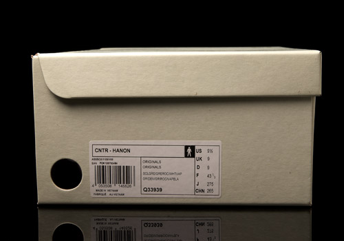
adidas CNTR x Hanon
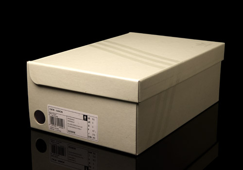
- MODEL: ADIDAS CNTR
- SERIES: ADIDAS CONSORTIUM
- DESIGNED BY: Hanon
- MADE IN: VIETNAM
- MADE ON: 11/12
- ART.NO: Q33939
- FACTORY: SHW 675001
Admittedly, the Centaur was not a silhouette I had immense familiarity with before preparing to write up this recent collab. In fact, I’m willing to bet that only a small subset of the larger, international sneaker culture was keen on this sweet trefoil runner from 1984. The reason behind this hunch of mine is that to see a Centaur you’d either need the keys to someone’s dusty trainer vault, or you’d have to go scouring through ancient product catalogs, granted that you could even get your mitts on some in the first place.
Now before the sneaker elitists out there get pissed and hit the back button, let me quickly explain why, for this very reason (lack of vintage knowledge), it’s so damn cool that adidas is bringing the Centaur back. Just like with Solebox’s stab at the Allegra, Originals is finally making some solid moves to get their vintage classics back into the hands of both those previously privy to them (and eagerly awaiting their hopeful return) as well as those who are seeing the silhouettes for the first time ever. While using their Consortium series to drop three new monochrome makeups to start, adidas has also played this revival similar to the recent Allegra; allowing a special sneaker boutique to take over the fourth design.
The Scottish city of Aberdeen is home to the Hanon Shop, owned and run by two brothers, Ed and Brian Toft. Known for their selection of limited edition, vintage, and otherwise hard-to-find sneakers, Hanon has become a leading name in the sneaker scene worldwide. Considering this – and their past collaboration with adidas Originals on a Kegler Super in 2010 – it’s no surprise that they’ve been selected by adidas to touch up the Centaur.
Ed, Brian, please tell us, how did this all begin?
Last winter the guys that head up the Consortium division of adidas visited us at our store and warehouse in Aberdeen where we discussed the possibility of collaborating on a new project.
That must have been an exciting chat! And how was the collaboration process?
As the project was quite close to our hearts, from a conceptual perspective we were set on the idea from the very start. Both ourselves and the Consortium guys had similar thoughts as to how we could get the shoe to look and from there the design process was seamless really. We were able to bounce ideas back and forth but much of what we were thinking was mirrored by adidas. The tooling for the Centaur also had to be reintroduced as this is the first time it had been re-issued. To see the development stages and the shoe come back to life as well our imagining of it was quite exciting. Aside from a couple of minor tweaks from the first sample round we were set to go.
Back up for us a bit – why was the Centaur chosen?
The Centaur was actually a suggested bring-back by the Consortium guys. When they visited us, we discussed a number of our favourite adidas growing up, of which ’80s running was touched on. There are so many styles from this era that have a big following in the UK such as the ZX and Torsion series. We were really excited when the Centaur was suggested for a collaboration. The shoe has that classic ZX aesthetic but is also set apart by the EVA colour blocks that instantly remind me of the Micropacer.
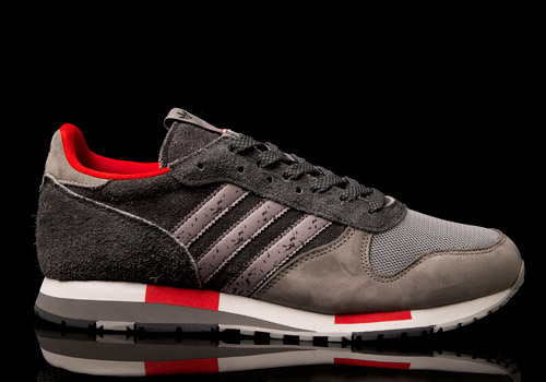
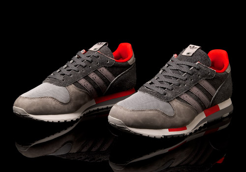
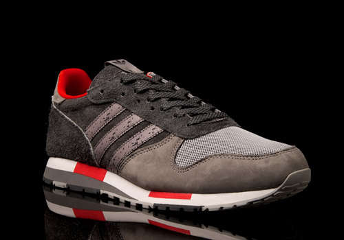
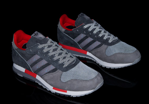
For those not so die hard trainer fans out there the main differences between the retro and the OG are simple: the midsole is a bit tamed on the new release and the past version’s upper stitching has been replaced with a lesser visible bond method, most likely a heat seal of some kind. At least on the other Consortium CNTR drops; as for these Hanon kicks they kept the stitching intact for the purists out there. Known as ‘The Silver City’, due to it’s surroundings which were ‘historically built from locally quarried granite’, the colorway was quite obviously inspired by Hanon’s hometown. The brother’s explain it better themselves in great detail:
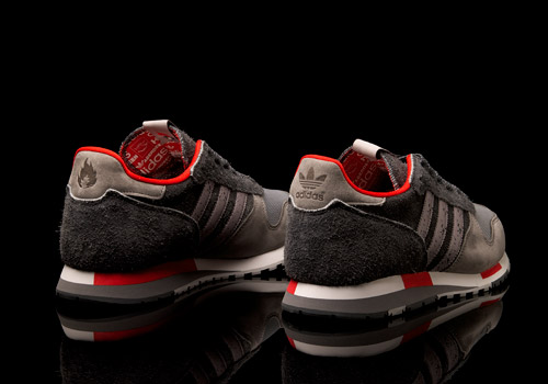
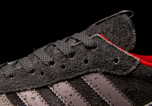
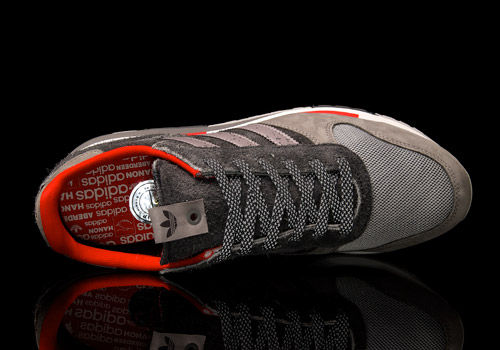
Executed in suede, mesh, and nubuck, the grey upper of the shoe model depicts the seasonal change of Aberdeen’s landscape. At the rear of the shoe there is a dark grey suede with a heavy nap representing the gloom of winter which is offset by a dual layered silver mesh and light grey nubuck that leans towards the fairer months of the year. Additional features appear by way of Aberdeen’s red accents, ‘granite’ three stripes, and multi print sock liner. The detail on the stripes was created by applying a mirror image print of the grain on the stonework at our warehouse to a black 3M reflective material, while the footbed and tongue backer draws inspiration from adidas’ archive boxes and tissue paper.
For our less geographically-scholastic readers can explain your colorway choices?
The silver-grey and red colourway is really a tribute to our hometown of Aberdeen. As you’ve mentioned, historically the city was built almost entirely from locally quarried granite which gives the architecture its character. In the winter it can feel quite bleak and dark and then in summer the buildings come alive and evoke a silver charm that feels like a polar opposite to the dark months. When the Consortium guys visited us in the winter they noted the all round grey vibe of the place as well as the foul weather! I tried to convince them of the two faces to the city and the idea for the collaboration kick started from there. Just to add: the red accents are a homage to the team colours of Aberdeen FC!
And the materials?
We wanted the materials to carry the Aberdeen theme and also to still feel respectful of an archive running shoe. Ultimately we wanted to ensure the Centaur was really wearable and would stand the test of time. From a concept perspective the colour way depicts the seasonal change of the city’s granite. As we’ve said, there is a thick suede at the rear with a heavy nap which represents the grey gloom of winter. This is nicely offset by a dual layered silver mesh and light grey nubuck that leans toward the fairer months of the year.
Any other inspirations that went into your final design?
Aside from the granite inspired theme, there are aspects of the shoe that point to the adidas back catalogue. We liked the idea of referencing details from the Originals archive and reinterpreting or updating them with a Hanon sign off. The execution of the footbed and tongue backer for example, is inspired by the multi logo print found on the archive boxes and adidas tissue paper. The shoe itself also acknowledges adidas’ heritage as despite the additional design concept, it still retains a classic look with an upper of mesh, suedes and nubuck.
What do you think is the importance of sporting heritage?
We think it is really important and there are only a small number of brands that can properly carry it off. Everything from the adidas Originals archive to my knowledge has been created for a sporting pursuit whether it be football, badminton, basketball or tennis. Even though some footwear styles from the past are not necessarily worn for the purpose of running or training today, there is still a sense of legitimacy and authenticity to a silhouette such as the Centaur which is impossible to create without the legacy of sporting heritage.
What details did you add to give this pair that good old ‘Hanon touch’?
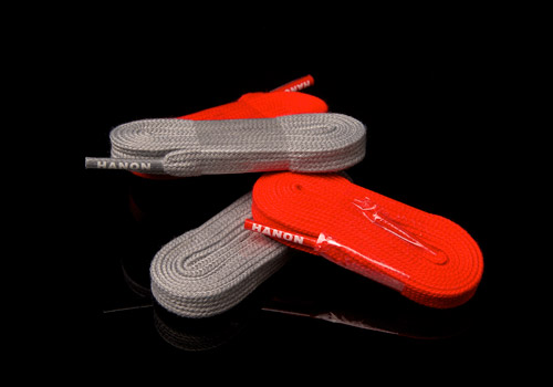
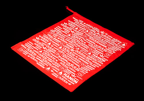
When we first starting collecting sneakers, I always liked the additional details that were secondary to the shoe. Extras such as hang tags, stickers, tissue paper and the type of box the model was released in were all key factors, and especially important if the shoes were deadstock. Each project we have worked on there has been some kind of add-on. For example a previous collaboration on the Kegler silhouette included an individually numbered foil sticker which was a nod to the gold sizing labels found in vintage editions of adidas footwear. To add a Hanon touch to the project we continued this approach. Each Centaur comes with a silver foil label, three sets of laces – one tonal, one contrast and one with a reflective weave. We are also working on a special edition dust bag that will be limited to a number of pairs for the launch of the shoe.
And lastly, what was your favorite aspect of the finished shoe?
My favourite detail would be the granite application on the three stripes. We created this effect by taking a photograph of the stonework at our warehouse in Aberdeen and making a trace of the image to bring out the grain of the granite. This was then applied as a grey overlay print to a black 3M material. As a result the stripes are nicely finished with a displaced speckled pattern that reacts to the light in a similar way to the buildings of the city.
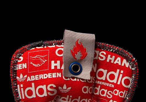
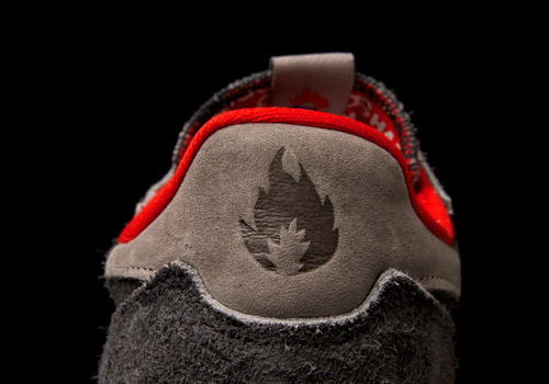
Thanks guys, we really appreciate the time and work you’ve put in here on these, they came out beautiful. As for the history about the pair, why the name has officially been changed to CNTR, we do not know. However names are only symbols, and the more important symbols in this release are quite definitely the side by side trefoil and ‘Keep on burning’ flame (embossed upon the shoe’s heels) signifying Hanon’s business slogan and teamwork with the infamous three stripes.
written by Dylan Cromwell
photography by errol

-
http://eatmoreshoes.com/10656/adidas-cntr-2013-q34725/ adidas CNTR 2013 | eatmoreshoes
-
http://eatmoreshoes.com/12998/benji-blunt-x-hanon-x-adidas-cntr/ Benji Blunt x Hanon x adidas CNTR | eatmoreshoes